
328: Twitter Bootstrap Basics
(view original Railscast)
Twitter’s Bootstrap helps you build beautiful web apps quickly. It provides a variety of CSS and JavaScript for making layouts, navigation, forms and a lot more and it even includes support for responsive web design. As an example, if you visit its homepage and alter the width of the browser window the page layout will change to best fit that width. This can really improve the experience of using web applications on mobile devices.
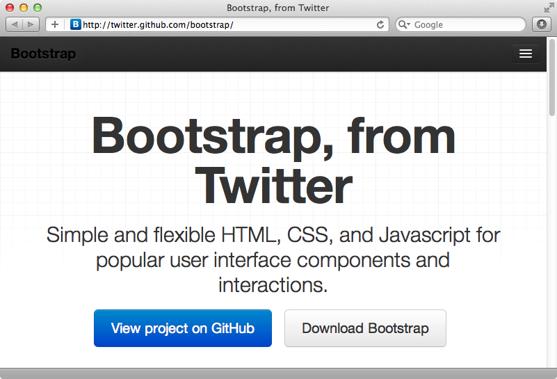
It’s well worth taking some time to explore the Twitter Bootstrap website to see everything that it provides but in this episode we’re going to show you how you can use it with a Rails application. One option is to download the static CSS and JavaScript by clicking on the “Download Bootstrap” button and then move the appropriate files into /app/assets directory. This isn’t the best approach if you’re using Rails, however. Twitter Bootstrap is written using LESS, which is a CSS preprocessor and which is very similar to the SASS used by Rails.
To get the most flexibility from Twitter Bootstrap it’s best to use it with a dynamic language, such as LESS, instead of using the static compiled files which it outputs. To get LESS working with Rails we’ll need the help of some Ruby gems. There are several gems available for integrating Bootstrap with Rails. In this episode we’ll be using the twitter-bootstrap-rails gem but we’ll mention some of the alternatives later. We’ve chosen this gem as it works directly with LESS and offers some nice generators to help us get started. We’re getting a little ahead of ourselves here, though as we don’t even have a Rails application to work with yet.
Adding Bootstrap to a New Rails Application.
We’ll start with a new app that we’ll call store and we’ll generate a scaffold for a Product model so that we have something to work with.
terminal
$ rails new store
$ cd store
$ rails g scaffold product name price:decimal --skip-stylesheets
$ rake db:migrate
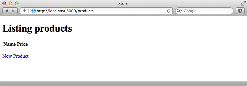
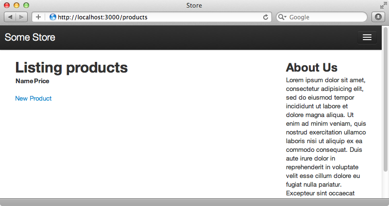
Note that we’ve used the --skip-stylesheets option in the scaffold as we want to use Bootstrap’s CSS instead of the scaffolding’s. We’ve also migrated the database so that the products table is created. Here’s what the generated scaffold page looks like. It isn’t very pretty as we don’t have any styling applied. It’s time to add Twitter Bootstrap.
The first step is to add the twitter-bootstrap-rails gem to the assets group in the gemfile. This gem is only needed in this group as it’s only used by the assets pipeline. If we’re using static assets in production then it won’t be needed.
/Gemfile
# Gems used only for assets and not required
# in production environments by default.
group :assets do
  gem 'sass-rails',   '~> 3.2.3'
  gem 'coffee-rails', '~> 3.2.1'
  # See sstephenson/execjs#readme for more supported runtimes
  # gem 'therubyracer'
  gem 'uglifier', '>= 1.0.3'
  gem 'twitter-bootstrap-rails'
end
We’ll need to run bundle next to install twitter-bootstrap-rails along with its dependencies. This gem has a number of dependencies including libv8 and less-rails and these enable our app to interpret the LESS syntax. Now that we have Bootstrap installed we can run its generator to install it.
terminal
$ rails g bootstrap:install
      insert  app/assets/javascripts/application.js
      create  app/assets/javascripts/bootstrap.js.coffee
      create  app/assets/stylesheets/bootstrap_and_overrides.css.less
        gsub  app/assets/stylesheets/application.css
        gsub  app/assets/stylesheets/application.css
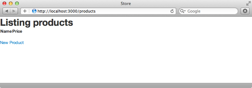
This sets up Bootstrap under the /app/assets directory. One key file that was generated is bootstrap_and_overrides.css.less. This file loads up Bootstrap and it’s a good place to customize the styling to suit your application. After we restart the server and reload the page we can see that the styling is already starting to look better, but there’s still a lot to do.
Improving The Layout
We’ll focus first on the application’s layout. The twitter-bootstrap-rails gem provides a bootstrap:layout generator for generating a layout file, but we won’t use that here. Instead we’ll walk through the steps required to change the layout to give you a better idea as to how Twitter Bootstrap works.
There are two kinds of layouts, fixed and fluid. A fixed layout is a specific pixel width, while a fluid layout will expand to the full width of the browser. Specifying either container or container-fluid as the class of the wrapper div will determine which layout is used. We’re going to use a fixed-width layout here so we’ll add a div with a container class to the body of the layout file.
/app/views/layouts/application.html.erb
<%= stylesheet_link_tag "application", :media => "all" %> <%= javascript_include_tag "application" %> <%= csrf_meta_tags %><%= yield %>
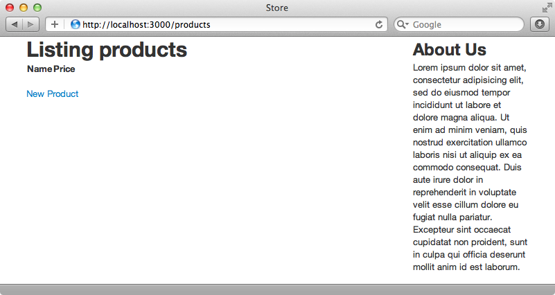
Twitter Bootstrap uses a 12-column grid system. This makes it easy to implement column-based layout designs by specifying the width of each column. This layout is responsive so if we reduce the width of the browser the layout will change accordingly. Let’s say that we want a sidebar in our design and that we want this to take up 25% of the width of the page. We can do that by modifying the layout file like this. We’ll just add some static text to the sidebar for now.
/app/views/layouts/application.html.erb
<div class="container">
  <div class="row">
    <div class="span9"><%= yield %></div>
    <div class="span3">
      <h2>About Us</h2>
      <p>Lorem ipsum dolor sit amet, consectetur adipisicing elit, sed do eiusmod tempor incididunt ut labore et dolore magna aliqua. Ut enim ad minim veniam, quis nostrud exercitation ullamco laboris nisi ut aliquip ex ea commodo consequat. Duis aute irure dolor in reprehenderit in voluptate velit esse cillum dolore eu fugiat nulla pariatur. Excepteur sint occaecat cupidatat non proident, sunt in culpa qui officia deserunt mollit anim id est laborum.</p>
    </div>
  </div>
</div>
When we reload the page now we’ll see our new two-column layout.
Adding a Navigation Bar
Next we’ll add a navigation bar to the top of the page with some links for navigating the site. The components section of the documentation describes the various navigation options that Twitter Bootstrap provides, including a navbar. This navbar can be customized to suit our needs and we can add links, dropdown sections, search fields and so on. The documentation has good examples of how we can add each type of item. We’ll add our navbar at the top of the layout page’s body.
/app/views/layouts/application.html.erb
<div class="navbar navbar-fixed-top">
  <div class="navbar-inner">
    <div class="container">
      <a class="btn btn-navbar" data-toggle="collapse" data-target=".collapse">
        <span class="icon-bar"></span>
        <span class="icon-bar"></span>
        <span class="icon-bar"></span>
      </a>
      <a class="brand" href="#">Some Store</a>
      <div class="nav-collapse">
        <ul class="nav">
          <li><%= link_to "Browse Products", products_path %></li>
          <li><%= link_to "Price List" %></li>
          <li><%= link_to "Contact Us" %></li>
          <li><%= link_to "Cart" %></li>
        </ul>
      </div>
    </div>
  </div>
</div>
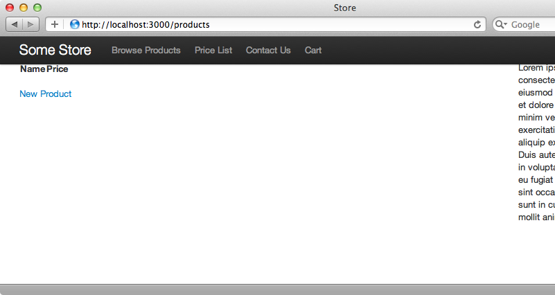
Our navigation has a brand name section and some placeholder links. The section at the top is interesting. It handles the collapsing behaviour when the browser resizes for the navigation. Reloading the page now will show our new navbar.
Note that we see the collapsed version of the navigation. This is because the browser window’s width is set to around 800px which means that it isn’t wide enough to show the full version. If we widen the window the navigation will appear.
There’s a problem when we do this, however. The top part of the page is covered by the navbar. This is a side effect of using a fixed navbar and the documentation tells us that to avoid this unwanted effect we should add at least 40 pixels of padding to the top of the body element between the Bootstrap CSS and the responsive CSS. We do this inside the bootstrap_and_overrides CSS file. This file includes the bootstrap and responsive files and the documentation says that padding needs to be added between these.
/app/assets/stylesheets/bootstrap_and_overrides.css
@import "twitter/bootstrap/bootstrap";
body { padding-top: 60px; }
@import "twitter/bootstrap/responsive";
// Set the correct sprite paths
@iconSpritePath: asset-path('twitter/bootstrap/glyphicons-halflings.png');
@iconWhiteSpritePath: asset-path('twitter/bootstrap/glyphicons-halflings-white.png');
// Your custom LESS stylesheets goes here
//
// Since bootstrap was imported above you have access to its mixins which
// you may use and inherit here
//
// If you'd like to override bootstrap's own variables, you can do so here as well
// See http://twitter.github.com/bootstrap/less.html for their names and documentation
//
// Example:
// @linkColor: #ff0000;
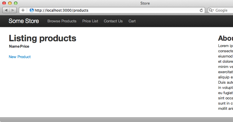
When we reload the page now the top of it is no longer hidden behind the navbar.
Final Tweaks to The Header
Our application’s layout file is pretty much complete now but there are a couple of thing we need to add in the head section to ensure that it works everywhere.
/app/views/layouts/application.html.erb
<head>
  <title>Store</title>
  <!--[if lt IE 9]>
    <script src="http://html5shim.googlecode/svn/trunk/html5.js" type="text/javascript"></script>
  <![endif]-->
  <%= stylesheet_link_tag    "application", :media => "all" %>
  <%= javascript_include_tag "application" %>
  <%= csrf_meta_tags %>
  <meta name="viewport" content="width=device-width, initial-scale=1.0">
</head>
The first piece of code we’ve added here improves the HTML 5 support in older versions of Internet Explorer. The second is a viewport meta tag and this fixes the responsive design behaviour on mobile devices.
Improving The Views
What about the other views in this application? There’s a lot that Twitter Bootstrap provides that can improve the look of the scaffold-generated code we have. First we’ll add a few product records so that we have some more content to work with.
Next we’ll use Twitter Bootstrap to improve the look of this page. Instead of walking through each change manually we’ll use one of the generators provided by the gem. This generator is called themed and is designed to work on top of scaffolding so we need to pass it the name of a scaffold. We also pass in the -f option to force it to overwrite the generated view files.
terminal
$ rails g bootstrap:themed products -f
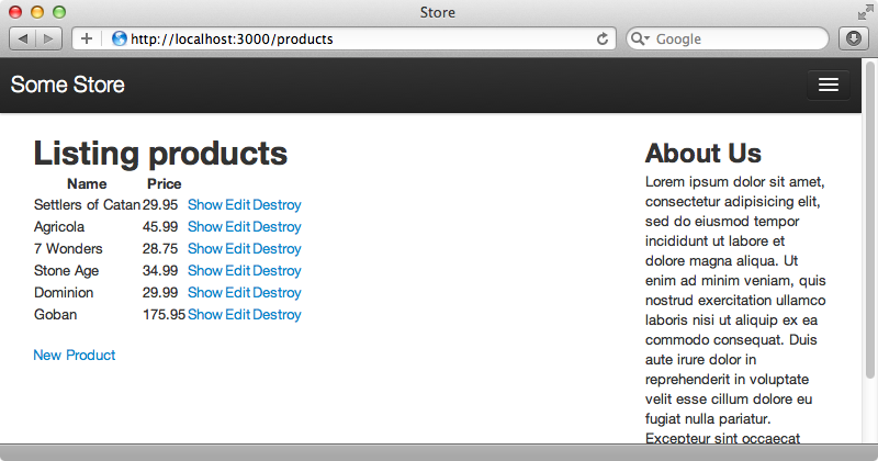
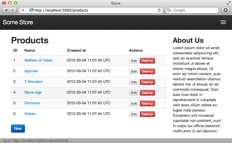
When we reload the products page now it looks much better. The table is a lot cleaner and the “edit” and “destroy” links now look like buttons instead of like plain text links.
Similar changes have been applied to the pages for viewing and editing a single product. We can view the source for these templates to see exactly how this works.
/app/views/products/index.html.erb
<h1>Products</h1> <table class="table table-striped"> <thead> <tr> <th>ID</th> <th>Name</th> <th>Created at</th> <th>Actions</th> </tr> </thead> <tbody> <% @products.each do |product| %> <tr> <td><%= product.id %></td> <td><%= link_to product.name, product_path(product) %></td> <td><%= product.created_at %></td> <td> <%= link_to 'Edit', edit_product_path(product), :class => 'btn btn-mini' %> <%= link_to 'Destroy', product_path(product), :method => :delete, :confirm => 'Are you sure?', :class => 'btn btn-mini btn-danger' %> </td> </tr> <% end %> </tbody> </table> <%= link_to 'New', new_product_path, :class => 'btn btn-primary' %>A couple of CSS classes have been added to the table that displays the products. Similarly classes have been added to the “Edit” and “Destroy” links to improve their look. The biggest change has happened to the partial that contains the form for creating or editing a product.
/app/views/products/_form.html.erb
<%= form_for @product, :html => { :class => 'form-horizontal' } do |f| %> <fieldset> <legend><%= controller.action_name.capitalize %> Product</legend> <div class="control-group"> <%= f.label :name, :class => 'control-label' %> <div class="controls"> <%= f.text_field :name, :class => 'text_field' %> </div> </div> <div class="control-group"> <%= f.label :price, :class => 'control-label' %> <div class="controls"> <%= f.text_field :price, :class => 'text_field' %> </div> </div> <div class="form-actions"> <%= f.submit nil, :class => 'btn btn-primary' %> <%= link_to 'Cancel', products_path, :class => 'btn' %> </div> </fieldset> <% end %>The code in here has changed significantly from the scaffolding code and it serves as a nice example as to how you can get a form to look really good with Twitter Bootstrap.
We’re nearing the end of this episode now and we said we’d mention some alternatives to the twitter-bootstrap-rails gem. There’s a list of these in this article on Ruby Source which explains how Twitter Bootstrap works and shows the various options and gems that are available for integrating it with Rails.