199: Mobile Devices
(view original Railscast)
Other translations:


It’s becoming more and more common to browse websites with mobile devices such as smartphones. Compared to desktop and laptop machines these have small screens and more limited abilities and given this it’s important to check your web applications on these devices to see how they work.
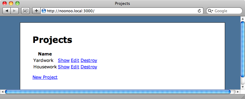
The best way to do this is to test your application on an actual device. Obviously “localhost” won’t work on a mobile device so you’ll need to use either the IP address of the machine your application is running on or its local domain name, assuming that your device is on the same local network. For example the machine that the application we’ll be using in this episode runs on is called noonoo so we can visit it from any other machine on the network by visiting http://noonoo.local:3000/.
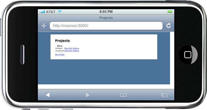
If you don’t have access to a physical device you might be able to download a simulator for the device you want to test your web application on. If you want to test on an iPhone then a simulator is available from Apple’s Developer site. Likewise an emulator is provided as part of the Palm Pré SDK.
For testing on the iPhone another alternative is iPhoney. This provides an almost exact emulation of an iPhone but isn’t as accurate as the simulator, although it is a much smaller download than the iPhone SDK. If you’re using it to test a site that will have different behaviour for mobile devices then you’ll need to remember to set the correct user agent from the iPhoney menu so that the correct content is shown.
Our application running on iPhoney.
This application’s appearance could definitely be improved for display on a mobile device and we’re going to spend the rest of the episode doing this.
To start we’ll add a stylesheet in our application’s layout file that will only be included if the application is being viewed on a mobile device.
/app/views/products/_fields.html.erb
  <!DOCTYPE html PUBLIC "-//W3C//DTD XHTML 1.0 Strict//EN"
    "http://www.w3.org/TR/xhtml1/DTD/xhtml1-strict.dtd">
  <html>
    <head>
      <title><%= h(yield(:title) || "Untitled") %></title>
      <%= stylesheet_link_tag 'application' %>
      <%= stylesheet_link_tag 'mobile' if mobile_device? %>
      <%= yield(:head) %>
    </head>
    <body>
    <!-- content omitted -->
    </body>
  </html>
The new mobile stylesheet will only be included if a method called mobile_device? returns true, and we’ll have to write this method. We could make use of the media attribute that the link element has to restrict the devices that would make use of the stylesheet, but mobile browsers can interpret this attribute in different ways. By using our own method to determine whether to include the stylesheet or not we can control which devices will include it by reading the user agent string sent by the browser.
Our next task is to write the mobile_device? method. We’ll put this in in the application controller so that the controllers can have access to this method.
/app/controllers/application_controller.rb
  class ApplicationController < ActionController::Base
    helper :all
    protect_from_forgery
    private
    def mobile_device?
      request.user_agent =~ /Mobile|webOS/
    end
    helper_method :mobile_device?
  end
Inside the method we check the request’s user agent to see if it contains either the word “Mobile”, which will match iPhone and Android devices or “webOS” which will match the Palm Pré. You can, of course, customise the regular expression to target whichever devices you want to show the mobile stylesheet. Finally we mark the method as a helper method so that we can access it from our views. If you want to be able to target a specific device there is a comprehensive list of mobile device agent ids available.
Now that we’ve written the helper method we’ll create the mobile stylesheet that mobile devices will use.
/public/stylesheets/mobile.css
  body {
    background-color: #FFF;
  }
  #container {
    width: 90%;
    min-width: none;
    margin: 0 auto;
    background-color: #FFF;
    padding: 0;
    border: none;
    margin-top: 20px;
  }
To see how the page looks with the mobile stylesheet we can make use of Safari’s user agent swapping feature. Under the Develop > User Agent menu is a list of user agent strings that can be selected, including several for various versions of Mobile Safari. If we pick one of these and look at our application again we’ll see the page with the mobile stylesheet applied.
Swapping Between Sites
Now that we have our mobile_device? helper method we can use it to alter the behaviour of the site depending on the device that is viewing it. One thing we’ll add is a link that will allow users to swap between the full and mobile versions of the site. To do this we’ll modify our application’s layout file by adding the following code at the top of the body.
/app/views/layouts/application.html.erb
<p>
<% if mobile_device? %>
<%= link_to "Full Site", :mobile => 0 %>
<% else %>
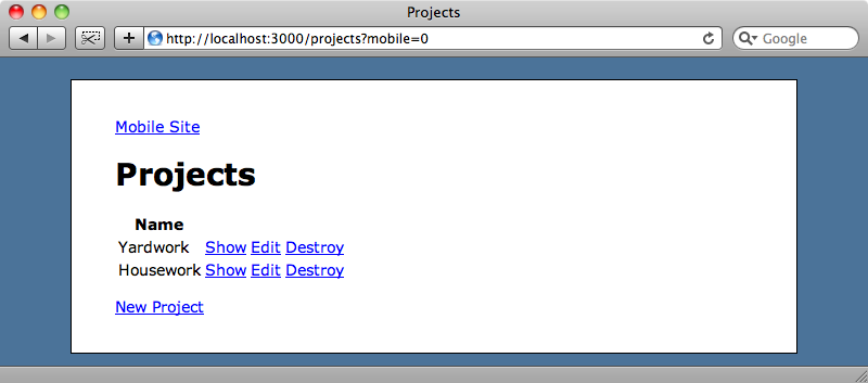
<%= link_to "Mobile Site", :mobile => 1 %>
<% end %>
</p>
This code will show a link to the full site if we’re currently looking at the mobile one and vice versa. The link will redirect to the page that’s currently being viewed with a query string parameter called mobile that will determine which version of the site to show.
In our application controller we can set up a before_filter that will set a session variable so that once the link has been clicked that version will continue to be seen as the user navigates through the site. The before_filter will set a session variable if there is a mobile parameter in the query string. We’ll also modify our mobile_device? method so that it will check to see if that session variable exists and, if it does, decide which version of the site to show depending on its value. If the session variable hasn’t been set we’ll decide based on the user string.
/app/controllers/application_controller.rb
  class ApplicationController < ActionController::Base
    helper :all
    protect_from_forgery
    before_filter :prepare_for_mobile
    private
    def mobile_device?
      if session[:mobile_param]
        session[:mobile_param] == "1"
      else
        request.user_agent =~ /Mobile|webOS/
      end
    end
    helper_method :mobile_device?
    def prepare_for_mobile
      session[:mobile_param] = params[:mobile] if params[:mobile]
    end
  end
If we reload the page now there’ll be a link to the full version of the site and if we click that link we’ll see the full version even though we’re viewing the page with a user agent string that contains the word “mobile”.
This preference will persist so that clicking any of the links above will keep us on the full version of the application.
Separate Views For Mobile Devices
What we’ve done so far will work for the cases where we want to fine-tune the application for mobile devices, but what if we have grander plans and want to change the application so that it looks and behaves more like a native application when viewed on a mobile device? To do this we’ll need to change pretty much every view in our application. How would we go about doing that?
The trick to doing this is to create a new MIME type in our application and Rails provides a file for doing just that at /config/initializers/mime_types.rb. The file contains a commented-out example for providing a new iphone type which we can modify to create a new mobile one. This gives us an alternative HTML format for mobile devices.
/config/initializers/mime_types.rb
  # Be sure to restart your server when you modify this file.
  # Add new mime types for use in respond_to blocks:
  # Mime::Type.register "text/richtext", :rtf
  # Mime::Type.register_alias "text/html", :iphone
  Mime::Type.register_alias "text/html", :mobile
We still need to set that MIME type, however and to do so we need to go back to the before_filter in our application controller and set the format to :mobile if the mobile version of the site is being viewed.
/app/controllers/application_controller.rb
  def prepare_for_mobile
    session[:mobile_param] = params[:mobile] if params[:mobile]
    request.format = :mobile if mobile_device?
  end
Now that the MIME type is set we can use it in our controllers’ actions to change the behaviour of each action depending on that type by using respond_to, as we’ll demonstrate in the index action of the projects controller.
/app/controllers/projects_controller.rb
  def index
    @projects = Project.all
    respond_to do |format|
      format.html
      format.mobile
    end
  end
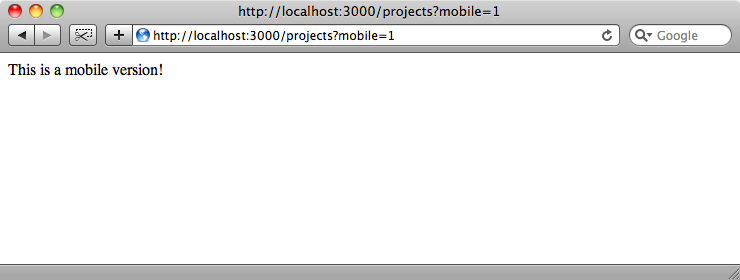
The respond_to block isn’t necessary, however, if we’re just providing an alternative view based on the format. In that case we just need to provide a new template with the name of the format in it where you would normally have html. For the index view above we’ll create a file called /app/views/projects/index.mobile.erb and to start with we’ll just put some text in the file.
/app/views/projects/index.mobile.erb
This is a mobile version!
If we visit the mobile version of that page now we’ll see the mobile view rendered.
Now that we have this in place we can create a UI that will fell much more like a native mobile application. There are a couple of libraries that we can use to make this easier: iui and jQTouch and we’ll be using jQTouch here. jQTouch makes it a lot easier to create a web application that looks and behaves like a native iPhone app.
After we’ve downloaded and unzipped jQTouch it will have a folder structure like this:
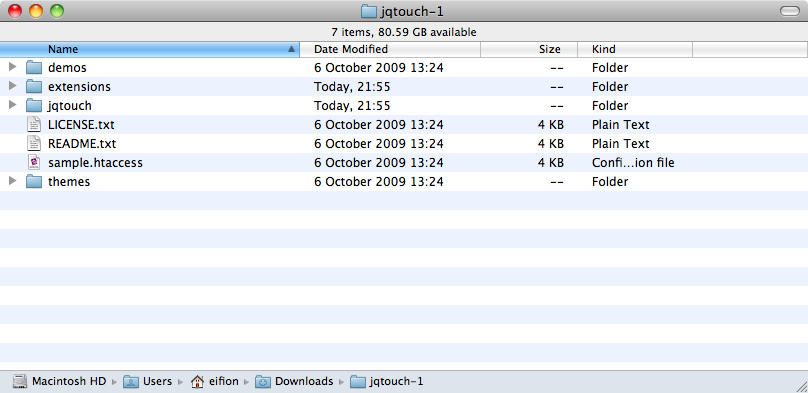
To make jQTouch easier to work with we’re going to move the extensions and themes folders into the jqtouch folder and then drag that folder into the our application’s public folder.
Next we’ll create a new layout file for the mobile version of our application.
/app/views/layouts/application.mobile.erb
  <!DOCTYPE html PUBLIC "-//W3C//DTD XHTML 1.0 Strict//EN"
    "http://www.w3.org/TR/xhtml1/DTD/xhtml1-strict.dtd">
  <html>
    <head>
      <title><%= h(yield(:title) || "Untitled") %></title>
      <%= stylesheet_link_tag "/jqtouch/jqtouch.min.css", "/jqtouch/themes/apple/theme.min.css" %>
      <%= javascript_include_tag "/jqtouch/jquery.1.3.2.min.js", "/jqtouch/jqtouch.min.js", "mobile" %>
      <%= yield(:head) %>
    </head>
    <body>
      <div class="current">
        <%- if show_title? -%>
        <div class="toolbar">
          <%= link_to "Back", nil, :class => "back" unless current_page? root_path %>
          <h1><%=h yield(:title) %></h1>
          <%= yield(:toolbar) %>
        </div>
        <%- end -%>
        <% unless flash.empty? %>
          <div class="info">
          <%- flash.each do |name, msg| -%>
            <%= content_tag :div, msg, :id => "flash_#{name}" %>
          <%- end -%>
          </div>
        <% end %>
        <%= yield %>
      </div>
    </body>
  </html>
In this layout file we include a couple of the CSS files that jQTouch provides along with references to jQuery and the jQTouch JavaScript. There is also a reference to a mobile.js file that we’ll create. In the layout the content of the page is wrapped in a div with a class of current. If the page should show a title then we’ll show it wrapped in another div with the class toolbar. Likewise if there is any flash text to show it will be displayed in another div, this time with an info class. Below that we yield to whatever is in the current template.
Next we’ll need to create the new mobile.js file. All we need to put in it is a call to the jQTouch initializer.
/public/javascripts/mobile.js
$.jQTouch({});
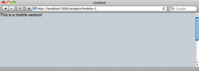
The initialiser function takes a hash of options but we won’t be setting any of them here. When we reload the mobile projects page again we’ll see the jQTouch styles applied, but the page will look fairly ugly as we don’t have any content in the page’s template.
If we go back to the page’s mobile view code we can replace the placeholder code with some code that will list all of the projects and a count of the number of tasks that each one has and a link to create a new project.
/app/views/projects/index.mobile.erb
  <% title "Projects" %>
  <ul>
    <% for project in @projects %>
    <li class="arrow">
      <%= link_to h(project.name), project %>
      <small class="counter"><%= project.tasks.size %></small>
    </li>
    <% end %>
  </ul>
  <ul><li class="arrow"><%= link_to "New Project", new_project_path %></li></ul>
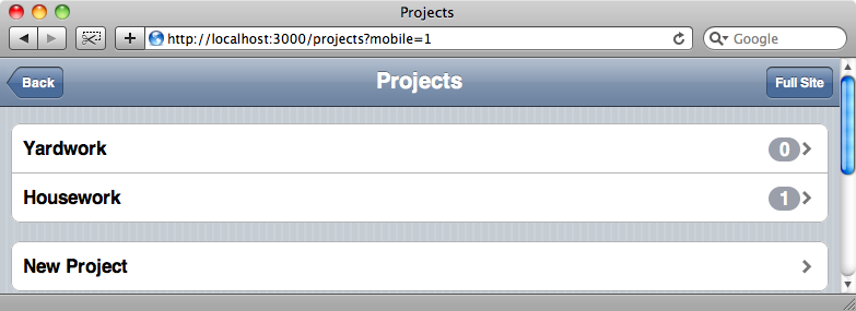
Reloading the page again we’ll see a nice interface that looks a lot like a native mobile application.
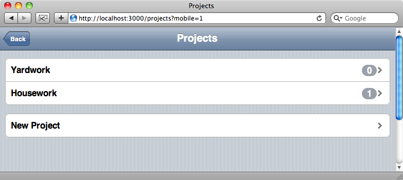
Obviously the interface will be rather narrower when viewed on an actual iPhone, but it works just as well on a desktop browser.
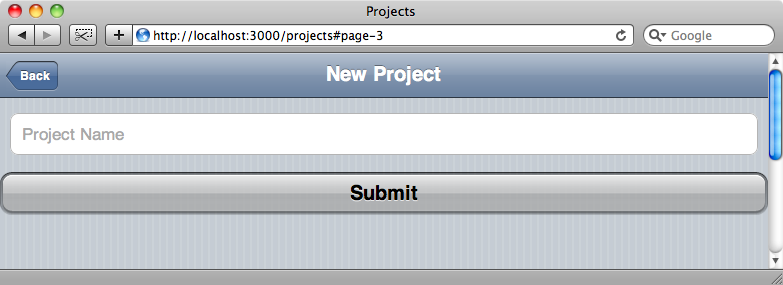
Every view file in our application will need a mobile version too. There’s too much code to list here, but you can download the files from Ryan Bates’ Github page. Once we’ve done that we’ll have a fully functional mobile application that looks like a native application.
While the mobile version of our site now looks a lot better we’ve lost the ability to swap to the full version of the site. We’ll add a button on the righthand side of the top toolbar to reenable this.
The toolbar is defined in the mobile layout file and adding new controls to it is easy as the jQTouch elements are defined with HTML tags. We can add a new button by creating a new link within the toolbar div and giving it a class of button.
/app/views/layouts/application.mobile.erb
  <div class="toolbar">
    <%= link_to "Back", nil, :class => "back" unless current_page? root_path %>
    <h1><%=h yield(:title) %></h1>
    <%= link_to "Full Site", root_url(:mobile => 0), :class => "button", :rel => "external" %>
     <%= yield(:toolbar) %>
  </div>
We also need to provide a rel attribute with a value of external so that jQTouch will treat the link as a link to another site. If we don’t do this it will make an AJAX request which isn’t what we want.
When we reload the page one last time we’ll have a button on each page now that will take us back to the full version.